A fresh start for Kempengenot
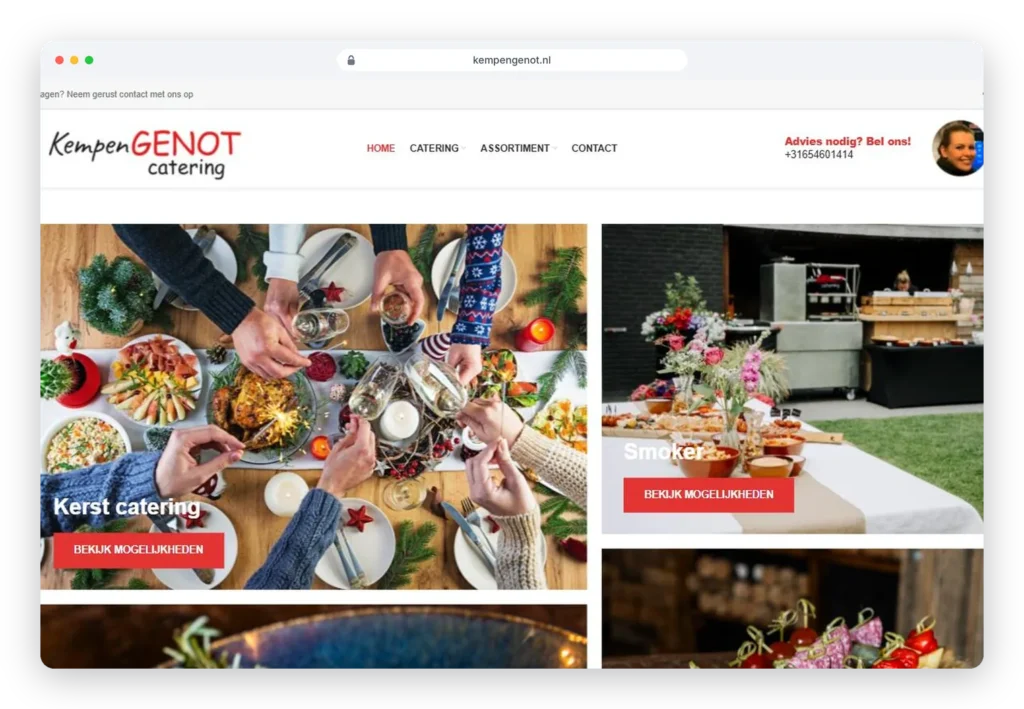
Kempengenot was ready for a new website. On the old site red was the dominant colour. That sounds bold, but the effect was the opposite: when everything is red, nothing stands out. The offering was also hard for visitors to take in.
Red as an accent, not a background
We renewed the entire look. The base is now calm and light, with red used deliberately as an accent colour, exactly where you want visitors to look: buttons, key information and the offering. The recognisable colour stays, but now it works for you instead of against you.
A clear offering in menus
The offering is now laid out in clear menus, complete with prices. Visitors quickly see what’s available and what it costs, without searching.
Update prices yourself
Changing a price shouldn’t be a job for a web developer. So we set up the back end so the site manager can update menu prices in a few clicks. That saves time and money, and the website is always up to date.
Pleasant on every device
The new design works just as well on mobile as on desktop. Handy for anyone checking the menu on the go.
What Kempengenot can do now
With a calm design, a clear offering and prices it can manage itself, Kempengenot has a website that’s accurate and stays up to date. Changes are no longer a project, just a matter of minutes.